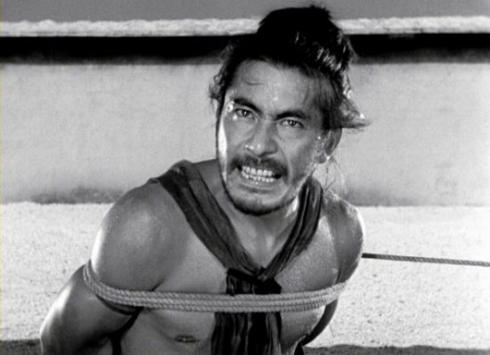
Video Essay: How Akira Kurosawa Framed Rashômon
Mr Nerdista has put together another fabulous video. This one takes a look at Akira Kurosawa’s Rashômon.
Whether he’s framing his characters to look primitive, or simply disobeying the rule of third for added effect, Akira Kurosawa’s vision and masterful directing is what makes Rashômon the flawless film that it is today. While the subject matter is intriguing, it would fall apart without the various styles of framing that Kurosawa employs throughout the film. In this video essay, I look at how and why he framed scenes the way he did.
The aspect ratio is not an error or lack of high quality footage – it’s to best preserve Kurosawa’s framing in the way that he intended that audiences view it.
Watch the video below and share your thoughts in the comments.


