Shhhhhh: LFF talks in hushed tones with A Quiet Place cinematographer Charlotte Bruus Christensen
Directed by John Krasinski, who also stars alongside his real-life wife Emily Blunt, A Quiet Place is an incredibly tense horror-thriller set in a world where the slightest sound can attract the attention of a lethal monster that will rip you and everyone you love to pieces.
It was one of the best films released last year and is currently available on digital, download, DVD and Blu-Ray everywhere so if you haven’t seen it yet you should definitely batten down the hatches, strap yourself in tight and check it out.
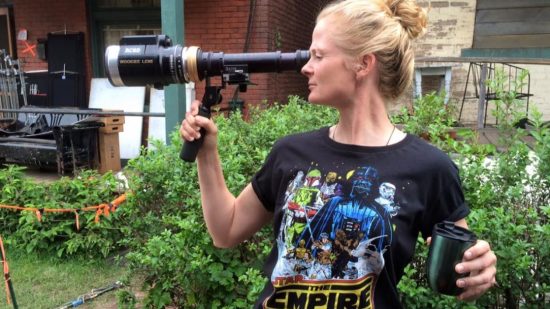
Charlotte Bruss Christensen is a visionary Danish cinematographer who has worked on The Hunt, Far from the Madding Crowd, Fences, and The Girl on the Train. As a cinematographer, Charlotte is responsible for a film’s visual impact utilising the camera and lighting to create striking images that enhance and advance a film’s story, so I was very eager to pick her brain about the look and feel of A Quiet Place.
She explains the technical and artistic reasoning behind the film’s camera placement, colour palette, and even her own chances of survival in a world of silence preyed on by razor-sharp hyper aware beasties.
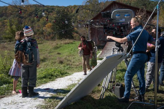
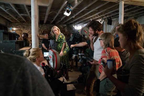
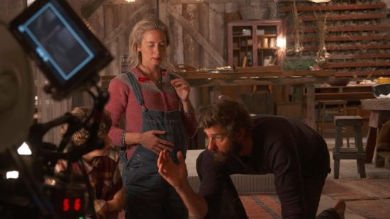
Left to right: Millicent Simmonds, Noah Jupe, John Krasinski, Emily Blunt and Charlotte Bruus Christensen on the set of A QUIET PLACE, from Paramount Pictures.
Hi Charlotte! I’m very excited to talk to you as A Quiet Place was one of my favourite films last year.
Oh great, great! It seems like a while since we made it. We shot it… it must be a year and a half ago now.
Oh gosh. OK. Well, hopefully, you still remember something about it!
[laughs]
To start with, how did you get involved in the film?
After doing The Girl on the Train with Emily Blunt we became really good friends and stayed in touch. She called me one Summer day and we were chatting and she said: “My husband’s making a movie and I’ve been saying he should call you and can I pass on your number?” And so it was actually Emily who put us in touch and had the idea that we would be a good match. She passed on my number and he called me like half an hour later and we had a long chat.
That was about a year before we actually shot the movie, which was great as we had such a long time to talk about it and I read the different drafts and got to understand what John wanted to do and his vision for the movie – so we had a lot of time to just chat about it.
That’s good. Obviously, the longer you have to prepare the better in your job, right?
Absolutely. Preparation for me is… more than shooting the movie. That doesn’t necessarily mean that everything needs to be storyboarded and you need to know exactly what you want to do, but for this particular movie – because it’s a high-concept movie – for John to make the whole thing work he was constantly developing the script. Improving it and changing little things. Like, either you believe in this world or you don’t and I think that for him it was so much about all the little details. So for a project like that the prep was crucial. For a world like that, you can’t get out there and make it happen on the day.
How did you go about coming up with the look of the film? Did John you give a particular brief?
He definitely did and that’s the way he works. He had a very clear vision for the direction he wanted it to go, and he was always like “There’s gotta be some poetic feel to this horror movie”. It’s a mix of genres and the poetry, the portrait of the family has to be… He wanted a very sophisticated horror movie. And so, he gave me references like: No Country for Old Men and There Will Be Blood and Jaws. All kind of old-fashioned, 35mm, very cinematic movies and he kept saying that “This must be a movie”, and he wanted an epic feel.
All the reference movies he gave me were very confident movies and we kept talking about what you do to make it “confident”. Like you don’t feel that you’re stressing the audience and that you need to run around and make people excited just by that energy – that the horror is in the story. So we wanted it to be slower, more sophisticated and confident, and it wasn’t that hard! We kept saying things like “Remember we want it to be confident, so maybe we don’t need to do all this complicated steadicam – maybe we just need to do this close-up, static, stay there, be confident.
So his pitch was maybe a bit ambiguous, but it certainly helped the look of the movie and we went backwards and forwards and it was a great dialogue.
It definitely comes across as a very confident movie. Stylistically, it’s a very warm film – there’s a lot of brown and gold and tobacco colours, but also a lot of small lens flares too that remind you of science fiction, and that this is a genre movie too and that an alien threat is always present.
Yeah, that was important. Also one of the references that John gave me at the very beginning of our conversation was that this was about a family and it’s about love – there’s a warmth to this. They had survived because of their relationship and the sign language and they had found their way, and that needed to be portrayed with warmth. It being a barn and the whole candlelit situation and all that, it was like everything around the family when they’re alone in their world is warmth. So that came from the lighting – we gave it candlelight colours but then on top of that the colour red is very important.
Red in the film is danger, and the colour of the warning lights they put on. So obviously the colour red became a character in the movie, and shooting it on film is very tricky. Sometimes the colour red can… it can be hard to focus on faces and things when they’re lit with the colour red, but that also gives a lot of warmth – but a dangerous warmth. Then to contrast, we had the cooler exteriors and the blue-ish night, without it being too “blue moon”, but just to give it some balance. We had a lot of colour conversations.
So the warmth and colours you mentioned were always important and when you look at a lot of horror movies a lot of them are cooler or green so I think it worked really well to mix it the way we did.
Were there visual elements that you needed to pay special attention to because of the lack of sound in the film?
Definitely. It was an ongoing conversation as well, but personally, what I realised early on was if you have to deal with the whole story of when can you hear what level of sound, and what level of sound is acceptable, you should think about how close somebody is to the lens. If you go really close to somebody you should hear sound: their clothes moving, breathing, footsteps in the sand, all that; so then in the same scene when you cut to a shot from a long lens further back there should be a corresponding cut in the sound design.
So we used that a lot, especially with Millie’s character, Reagan. Because she’s deaf there’s was a desire to be really close to her, and when you cut in close to her you are inside her head and everything goes totally quiet. So there was a lot of thinking put into the visual story, but also how it would then interact with the sound design. So character’s distances from the lens was something I worked on a lot.
There was a cool technique that I read about you using on The Girl on the Train where you purposefully dropped frames and repeated frames to convey Emily Blunt’s character’s drunkenness. Is finding that balance of the technical and the artistic the key to your job?
It’s a brave thing to do because when you start doing things like that in camera on film there’s no undo button. So it’s technical but to achieve an artistic way of storytelling. I find it quite easy to balance the two because I only do things for artistic reasons and then to use those tools you have to achieve them. With something like that there is a lot of talk with the producers because it’s a big decision, but I love that. And I love that there is so much you can also do in post-production these days. You can shoot on an iPhone and make it look good, you can do that step printing for the repeat frames afterwards. But I like to make those decisions on set because then it’s artistic and for the story and not just to make it look cool later, and that’s what I think happens sometimes. We did it to serve the story.
With A Quiet Place, we spoke a lot about the amount of black, for example. When there’s a lot of black and you don’t see anything – you hear more. You hear every tiny little sound. Like when he carries her into the basement after she’s just given birth, there is are no light whatsoever, and they go through just a little sliver of light. That darkness is a technical choice and done with lighting and exposure, but it’s a storytelling choice.
That’s what I love about my job as a cinematographer. Figuring out when and where to use the tools to assist the story.
How long do you think you would survive in the world of A Quiet Place?
[laughs] Me personally? I think I would survive. I think I’m pretty good at being quiet. Disappearing into the woods and just doing what you had to do. But that’s an interesting question!
Thank you very much for taking the time to talk to us today. It’s been very interesting and insightful.
You’re very welcome.
A Quiet Place is available on digital, download, DVD and Blu-Ray everywhere now.

